
Designing a patient management MVP for psychologists
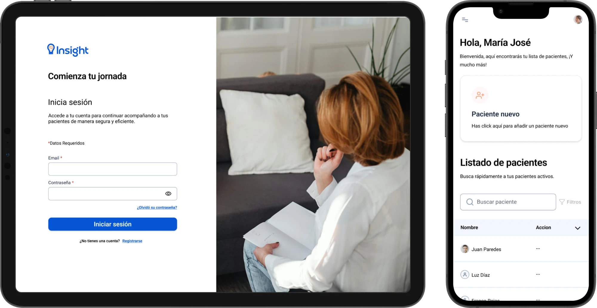
Insight brings patient information, clinical histories, and session notes into one web application. During a five-week practicum with Foo Talent Group, I coordinated the design team’s work.
Alongside two other designers, I worked across research, interaction design, UI design, and prototyping. The parts I led:
- Brought scope and user needs into team decisions, including the idea of focusing the first release on the psychologist’s workflow, which we decided together.
- Coordinated fixes to back navigation, login feedback, and patient list filters, keeping developers, QA, and project management in the loop.
- Documented updates and unresolved interactions in the shared Figma file, with separate versions for exploration and handoff.
Patient information was spread across paper records, files, and messages
Our starting point was an interview with a psychologist working in a preschool support setting in Mexico. Retrieving previous observations and effective interventions was difficult when records were kept on paper or across separate files.
We extended the research through conversations and surveys with psychologists and people receiving psychological care. Our challenge was to make patient information easier to organize and retrieve within the professional’s daily workflow.
How can we help psychologists keep patient information connected and easy to retrieve throughout their daily workflow?
Focus the first release on the psychologist’s workflow
The initial proposal covered both sides of care: tools for psychologists to record and organize information, and ways for patients to receive summaries, tasks, and reminders.
Supporting both experiences would have meant designing and building almost two applications. With a short delivery window, we prioritized the psychologist’s workflow so the team could develop a coherent first release.
The MVP focused on:
- Account access and recovery.
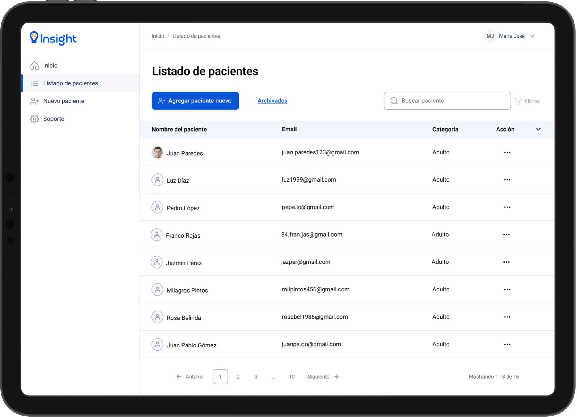
- Creating, viewing, editing, searching, filtering, and archiving patient records.
- Creating and updating a patient’s clinical history.
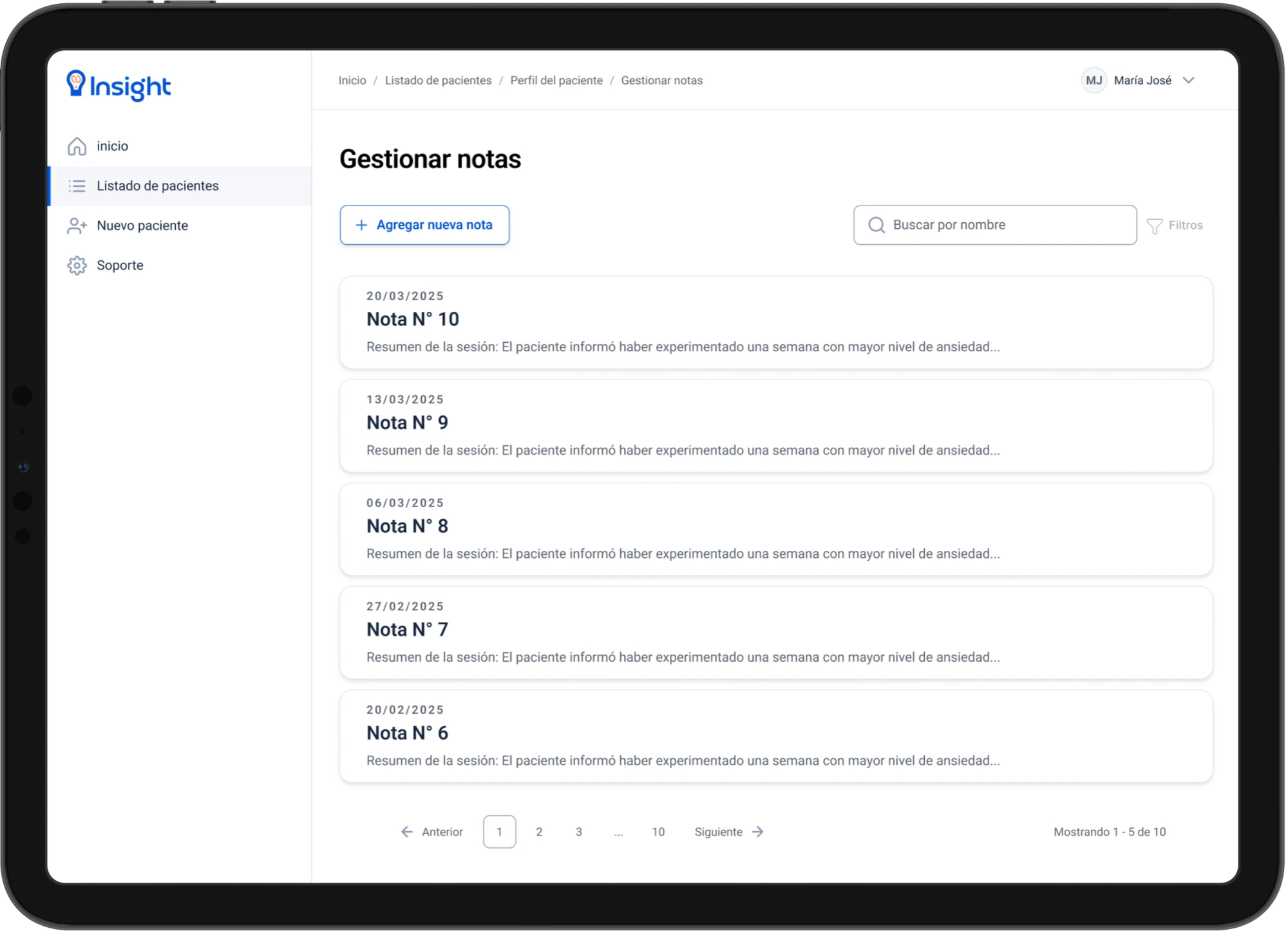
- Creating, editing, deleting, and finding session notes.
Scheduling, automated reminders, patient-facing communication, and sharing or downloading materials were deferred to future releases.
Make recording information feel straightforward
Records needed a consistent home
Psychologists recorded observations, recurring phrases, changes in mood or behavior, and topics to revisit. These different kinds of information needed to remain connected to the relevant patient.
Simplicity mattered alongside functionality
The research synthesis emphasized an interface that felt as easy to use as a notebook. Psychologists also described using WhatsApp for convenience while finding messages outside working hours intrusive. We needed to consider ease of adoption alongside professional boundaries.
Patients valued clear follow-up, with different preferences for receiving it
Some patients wanted summaries, feedback, tasks, or reminders, but preferences varied around adding a dedicated application. An early proposal considered delivering selected information through existing channels without requiring patient sign-in. This informed the broader concept as we narrowed the MVP to professional use.
Check where people expected to find key functions
We ran an unmoderated card sorting study in Useberry with 16 cards. Ten sessions were recorded and six participants completed the classification. The study explored the broader product architecture, including functions later deferred from the MVP.
Participants sorted cards into the available categories: appointment calendar, patient data manager, new patient form, my profile, and an option for cards they could not place.
| What we observed | What it told us and what we did |
|---|---|
| All 6 participants placed patient search filters in the patient data manager. | There was a clear shared expectation for where to find patient search. In the design, search and filters sit together on the patient list. |
| All 6 placed scheduling the next appointment in the calendar. | Scheduling had a clear home within the broader proposed architecture. Scheduling was later deferred from the MVP. |
| 4 of 6 placed session notes in the patient data manager. | Most expected notes to be grouped with patient information. Session notes live inside each patient’s record. |
| Clinical history was split evenly between the patient data manager and my profile. | The split suggested ambiguity about whose information belonged in each category. This informed how we separated the professional’s account from a patient’s records. |
| Username was split evenly across the patient data manager, new patient form, and my profile. | The distribution suggested that the label needed more context. |
These patterns informed our architecture discussions, particularly the distinction between the professional’s account and a patient’s records.
Organize the product around patients and their records
Start with finding the right patient
The patient list acts as an entry point to individual records. Search and filters support locating a patient before reviewing their information or continuing documentation. Keeping these actions together follows the strongest grouping pattern from the card sorting study.
Keep clinical history and session notes distinct
The design provides separate places for a patient’s clinical history and notes from individual sessions. This supports both an ongoing view of the patient and a record of what happened during a specific consultation.
Make interaction states part of the handoff
We designed empty states, validation, loading, and confirmation feedback alongside the main screens. I coordinated adjustments to back navigation, login feedback, and patient list filters, incorporating questions and feedback from the team.
I documented updates and unresolved interactions in the shared Figma file. Separate versions for design exploration and developer handoff supported discussions about intended behavior as well as appearance.
Deliver a focused foundation for patient management
The team delivered a working MVP for managing patient records, clinical histories, and session notes. Prioritizing the psychologist’s workflow gave us a clear scope to design and develop within the program.
From this project I learned to make priorities explicit, bring unresolved questions into discussions, and keep design decisions connected to development constraints.
The next step would be task-based usability testing with psychologists: finding a patient, retrieving relevant information, and documenting a session. Those tasks would guide further refinement before expanding into scheduling or patient-facing features.